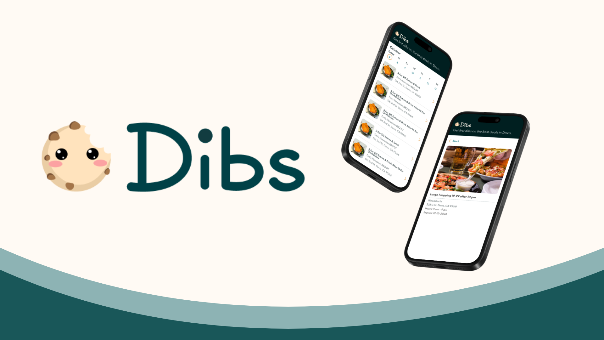
Dibs is a mobile web app designed to help students at UC Davis discover the best weekly restaurant deals in town. Built from the ground up as part of AggieWorks, Dibs solves a common problem: students want affordable dining options, but deals are scattered across social media, outdated websites, or word-of-mouth. Dibs centralizes and streamlines this process, offering a frictionless experience for users and increased visibility for local businesses.
As the Product Designer of Dibs, I lead the end-to-end design process, from user research and wireframing to high-fidelity prototypes. Collaborating with developers and stakeholders, I focused on creating a minimalist, intuitive interface that allows users to quickly scan deals without cognitive overload.
I collaborated closely with a cross-functional team consisting of:
- 3 Engineers (developing the platform infrastructure and front-end UI)
- A Project Manager (ensuring alignment and timelines)
- A Product Marketing Manager (developing strategies for user acquisition and restaurant outreach)
- A Technical Product Manager (defining technical feasibility and ensuring smooth implementation)
The Problem
While many Davis restaurants offer student discounts and limited-time promotions, there was no single, reliable source to track these deals every day. As a result, students often missed out on great deals simply because they weren’t aware of them.
Research
I helped conduct user interviews, and designed & deployed surveys on Airtable. We received 50+ responses to identify pain points in finding deals. In addition, I analyzed competitors, noting gaps in real-time deal updates and user engagement.

Synthesis and Ideation
I designed a mobile-website first, ensuring easy browsing on the go. I also simplified navigation to a vertical scrolling list to display deals in a user-friendly way.

Hi-fidelity
Through iterative user testing and analytics tools like PostHog, I gathered feedback and data to refine navigation, simplify the onboarding flow, and prioritize features like clear deal visibility and seamless access, making sure that the app met both user needs and business goals.

First iteration.

Second iteration.
