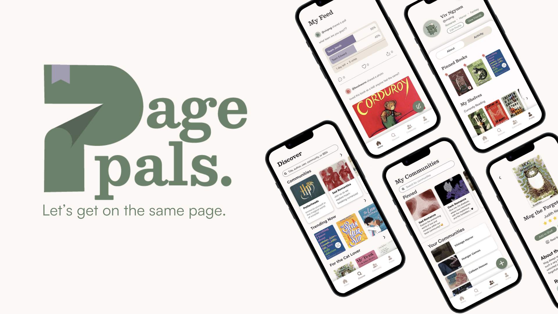
Introducing PagePals — the ultimate destination for bookworms seeking to broaden their literary horizons and find a community of like-minded readers. PagePals was created in a six-week design sprint at UC Davis as part of Design Interactive’s 2023 Fall Cohort. Through extensive research, ideations, and many rounds of iterations and prototyping, we created a centralized hub that simplifies book discovery and fosters cozy communities.
The Problem
Book platforms have emerged as the newest way for readers to discover new liHi-fi Prototypingterary experiences. Although traditional sites like Goodreads have tried to meet readers' needs, recently social media has played a more significant role in building reading communities and facilitating book discovery.
| Readers face challenges in locating a single, centralized space for all their reading and sharing activities.
Research
We began by conducting a survey using Google Forms. We wanted to scope out reading community demographics, their reading habits, and how they engage with reading community platforms. From our survey, we garnered 80+ qualitative and quantitative responses.
One of the key findings we discovered was that 55% of users felt uncomfortable about sharing their reading experiences online due to factors such as social pressure, restricted customizability, limited visibility, or other concerns. Recognizing this, we knew it would be important to establish strong user autonomy by providing an wide range of customization options.

We also conducted a competitive analysis to explore the current landscape of reading-related apps. From our survey data, we gathered that Goodreads, Instagram, and TikTok were the top 3 most commonly used platforms, so we compared their distinct features to gain insights into what elements might hold significance for users in the future.

Leveraging the data from our survey, we formulated interview questions and carried out 5 one-on-one interviews to gain deeper insights into users' reading experiences. We discovered three key insights:
- Algorithm-based suggestions were a main benefit of social literary platforms.
- Users want more freedom when it comes to interacting and creating book posts
- Finally, users struggle to find groups where their voices can be heard.
Synthesis and Ideation
| Affinity Mapping
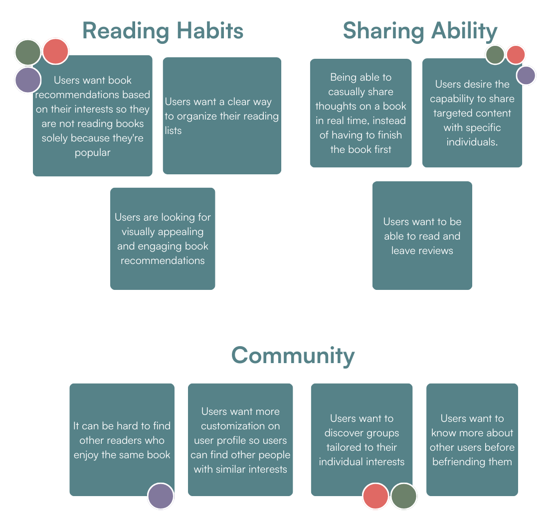
We created our affinity map by categorizing our qualitative and quantitative findings into various groups to identify key pain points. These groups included reading habits, community, wanted features, sharing abilities, and other apps they used for books, and other pain points.
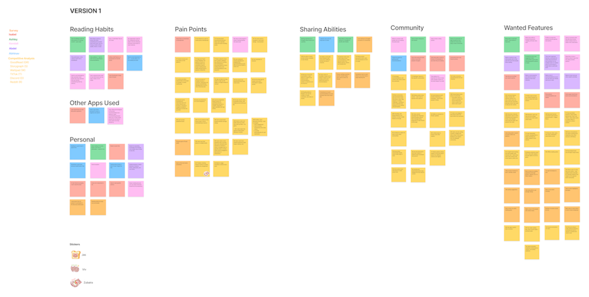
We iterated on this map to make it more cohesive and organize it into its most relevant points.
| User Persona
Our user persona is the heart of our design process as it reflects the needs, wants, and experiences of our target audience. We created this persona based on our extensive qualitative and quantitative research. Doing so allowed us to further focus on user needs and experiences as well as guide our decision making in developing our product.

We sketched possible solutions to address our user’s needs:
| Low Fidelity Wireframe Sketches
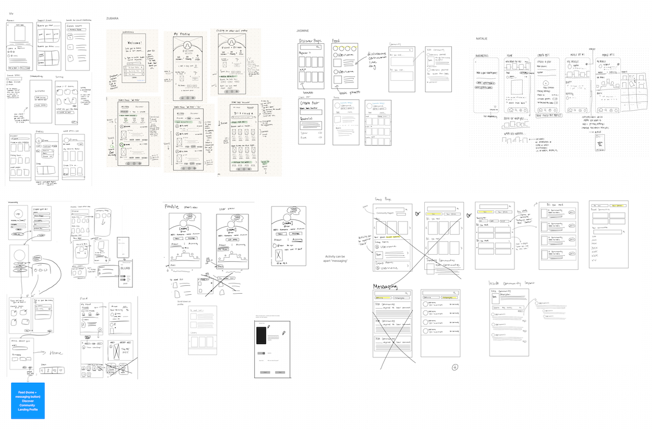
| The Final How Might We Statement:
How might we create a dynamic literary platform that facilitates connections, sharing, and discovering books while ensuring a personalized and engaging user experience?
Mid-Fidelity Prototyping
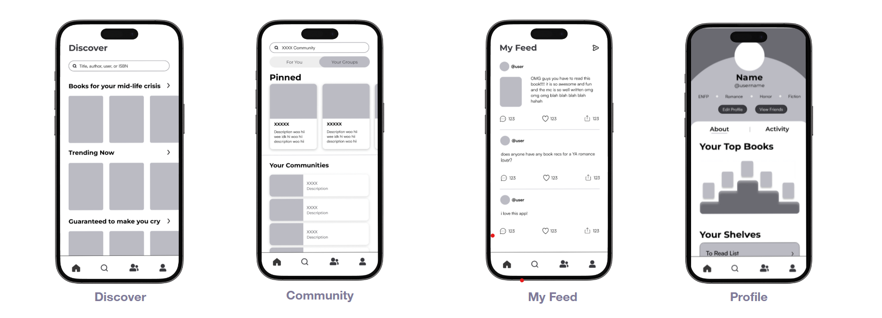
From our sketches, we created and developed many mid-fi frames and decided on 4 main pages to guide our app as displayed on our navigation bar:
- “Profile” where users can express their interests through various customizable displays
- “Discover Books” where users can explore algorithm-based suggestions and niche categories catered to their interests
- “Community” where users can find personalized communities to join, interact, and befriend like-minded readers
- “My Feed” where users can view and interact with friend activity as well as create posts of their own
- “Onboarding” page where users can customize their profile and answer questions to inform the algorithm-based suggestions.
Usability Testing
We conducted usability testing on our mid-fidelity prototype, engaging with 5 users whose feedback informed revisions and enhancements to our designs. The participants navigated through the task flows outlined above.
- Account creation & onboarding quiz
- Book & review exploration
- Post & review creation
- Private Messaging
- Community joining
| Positive Feedback
User testing participants stated that they enjoyed the overall concept of our app. Participants expressed high satisfaction with our designs.
| Areas of Improvement
Although users enjoyed the app concept, users did face some challenges when navigating through our app. With this in mind, we reiterated and focused on creating intuitive and clear design elements:
| Unintuitive icons cause navigation confusion
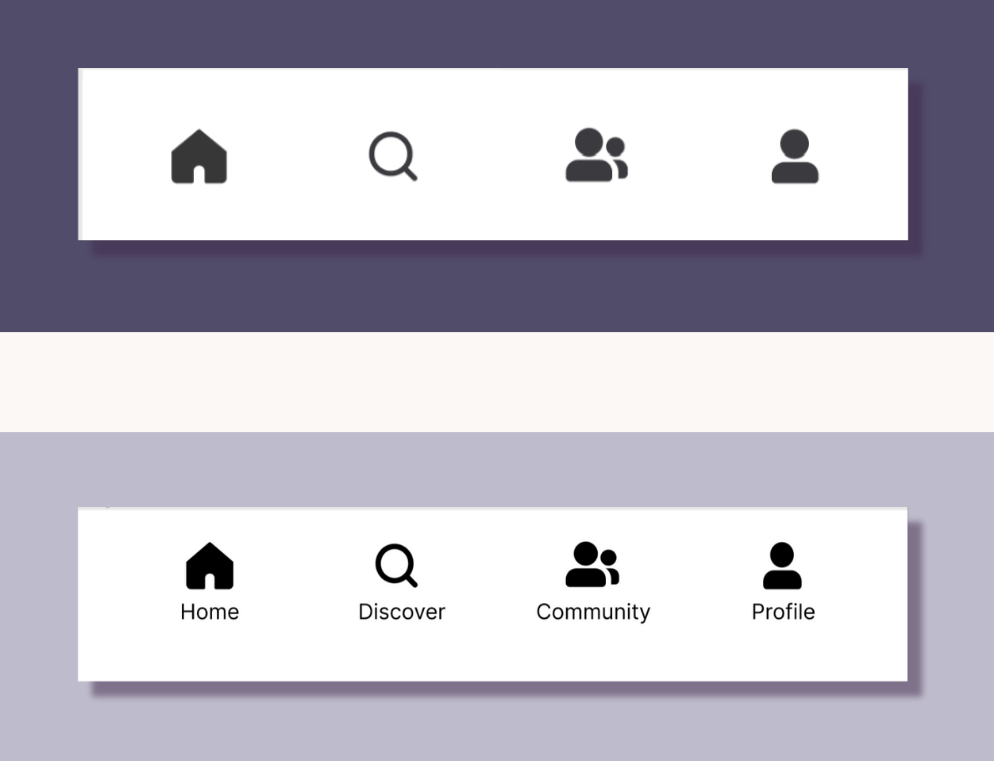
Our navigation bar before (top) and after (bottom) with text displaying icon meaning.
| Lacking clear distinctions among community group posts, reviews, and My Feed posts as well as with post content types

Our feed and posting before (left) and after (right) with headings for each post type and distinction of post destination.
| Users can’t discover groups from the discover page and must navigate to community page to do so
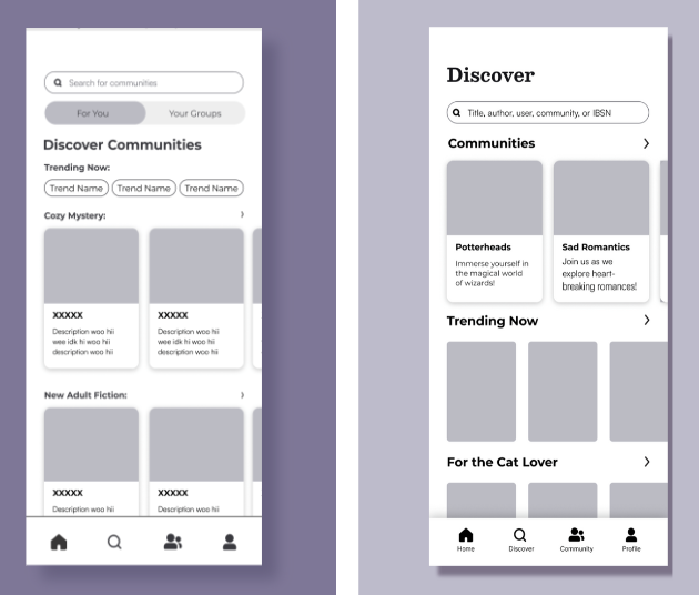
Our Discover Communities tab on Community page before (left) and our movement of the discover groups feature to the Discover page after (right).
| Users can’t tell that the book pop-up is expansive and hard to locate the “Add a Review” button
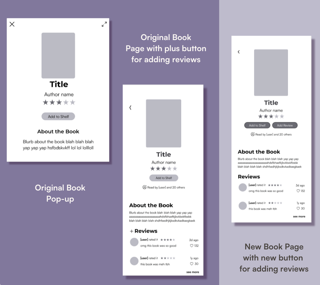
Our original book pop-up and book page (left) and our reiterated book page with no pop-ups (right)
Hi-Fidelity Prototyping
| Design System and Branding
We began our Hi-Fi process by curating a color palette that is reminiscent of books and reading. Inspired by the familiarity of paper, we chose calming shades of beige for the backgrounds. By incorporating contrasting colors—turquoise, plum, seaweed, and blush—we create a strategic visual hierarchy that guides users' attention to call-to-action buttons among the cozy, neutral atmosphere.
We chose Satoshi and Besley as our fonts, which serve as a balance between contemporary and classic typographic elements, making them ideal for an app that celebrates the timeless appeal of books while promoting socialization through modern means. We anticipate book enthusiasts to spend extended periods on an app that involves reading, so the choice of soothing colors is gentle on the eyes and reduces eye strain.
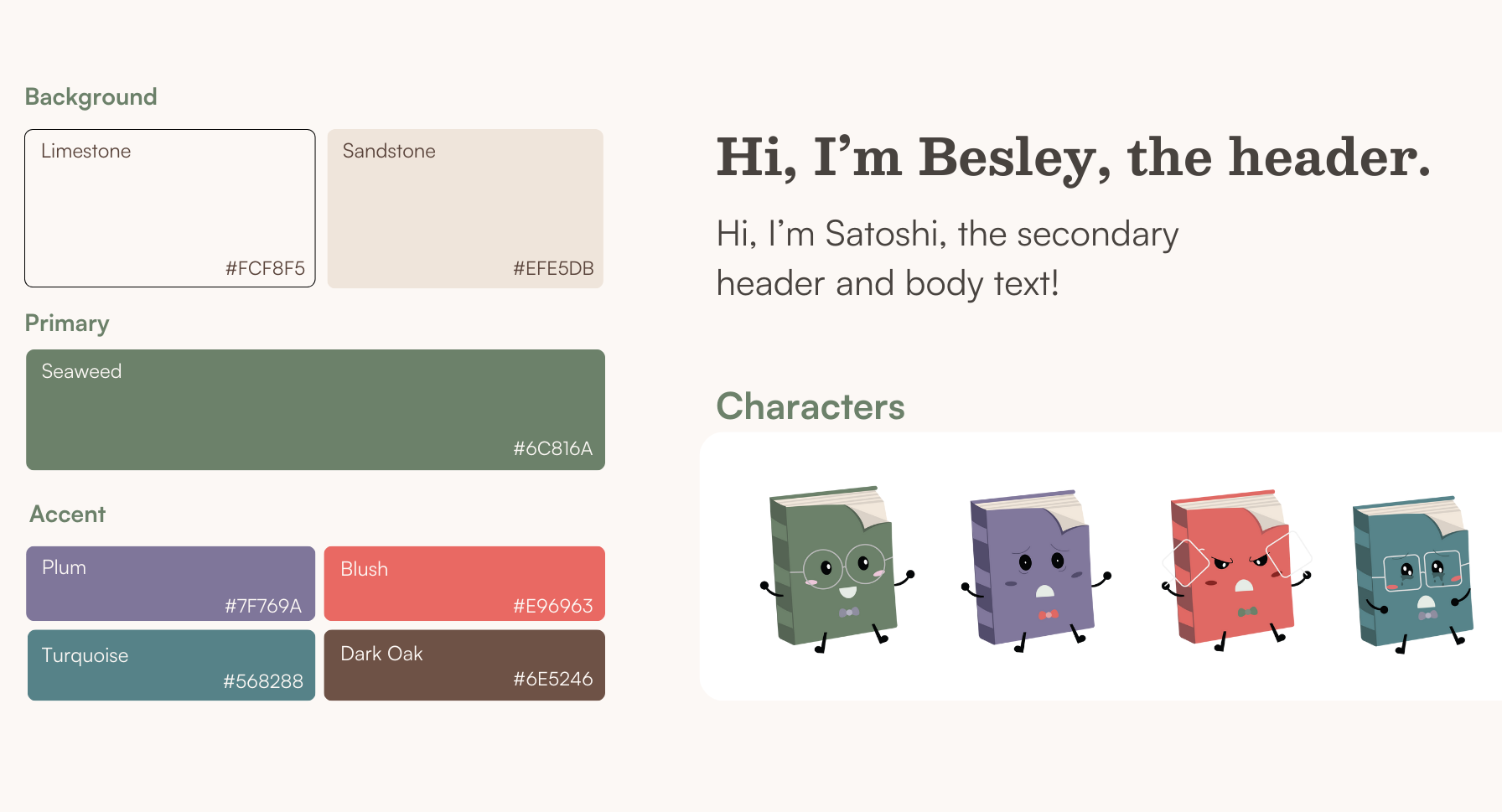
Our brand elements
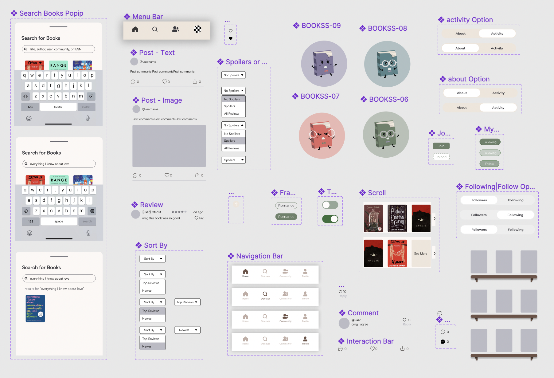
Our components
| The Final Prototype
Thus, we formed the blueprint for the app’s evolution, allowing for the transformation from a grayscale mid-fi prototype to a refined app. We further improved our prototype by implementing valuable insights extracted from usability testing.
Onboarding
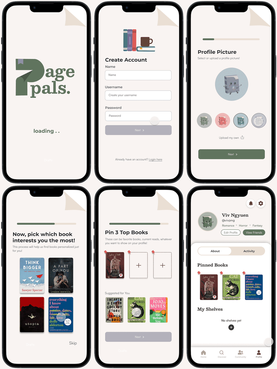
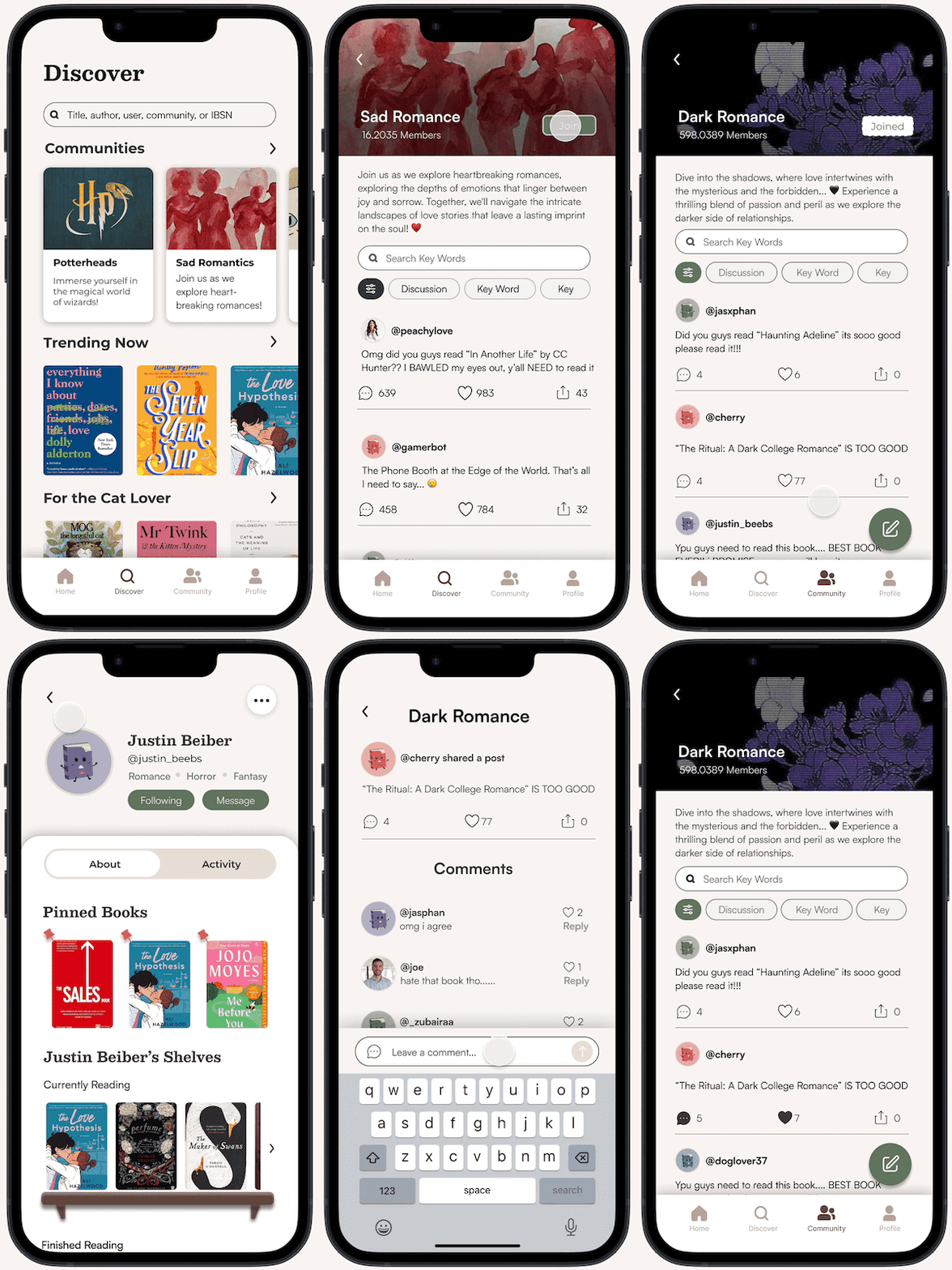
Customization of the profile includes options for setting a profile picture and pinning favorite books. The onboarding assessment is designed to enhance personalization by offering tailored book recommendations based on individual preferences. Users are asked to select different genres and books they are interested in.
Community
You can join or create book communities, where you can create and interact with posts. Users can also participate in active discussions, which allows users to engage with fellow members, sharing insights, and opinions. Additionally, you can explore the profiles of other members to discover their literary preferences and connect with like-minded individuals.
Discover Books
You can explore recommended books, genres, and niches to discover new and exciting reads. Users can expand their reading experience by adding new and interesting books to their shelf. Users can also explore reviews and conveniently filter out spoilers to maintain the element of surprise and enjoyment.

Casual Posting
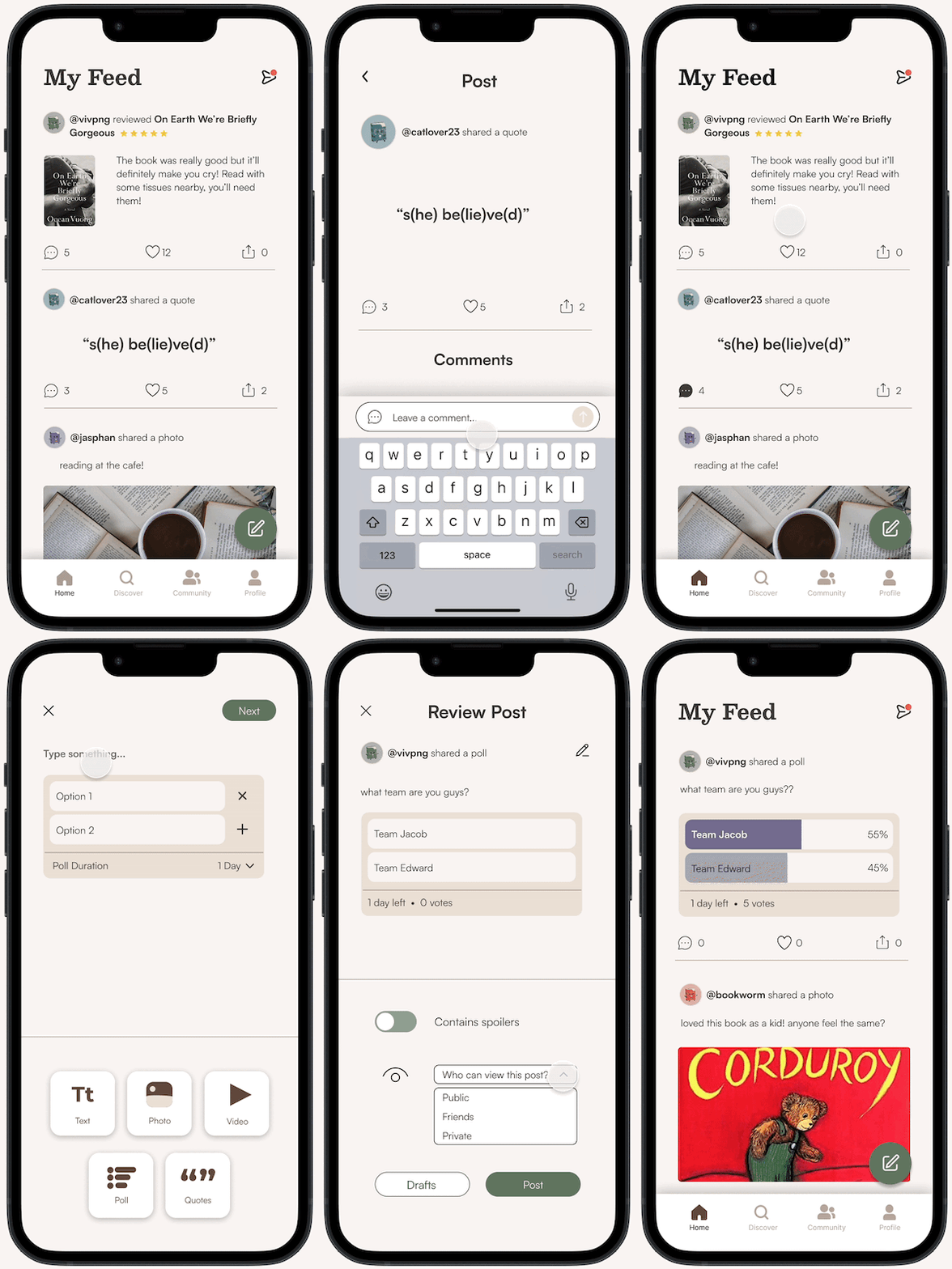
The platform also accommodates casual posting, providing a space for relaxed and informal communication about books. The platform offers a variety of tools for users to share their reading experiences, such as polls, posting quotes, photos, and videos. You can interact with fellow users, fostering a sense of community and shared enthusiasm for literature.
Presentation Day & Next Steps
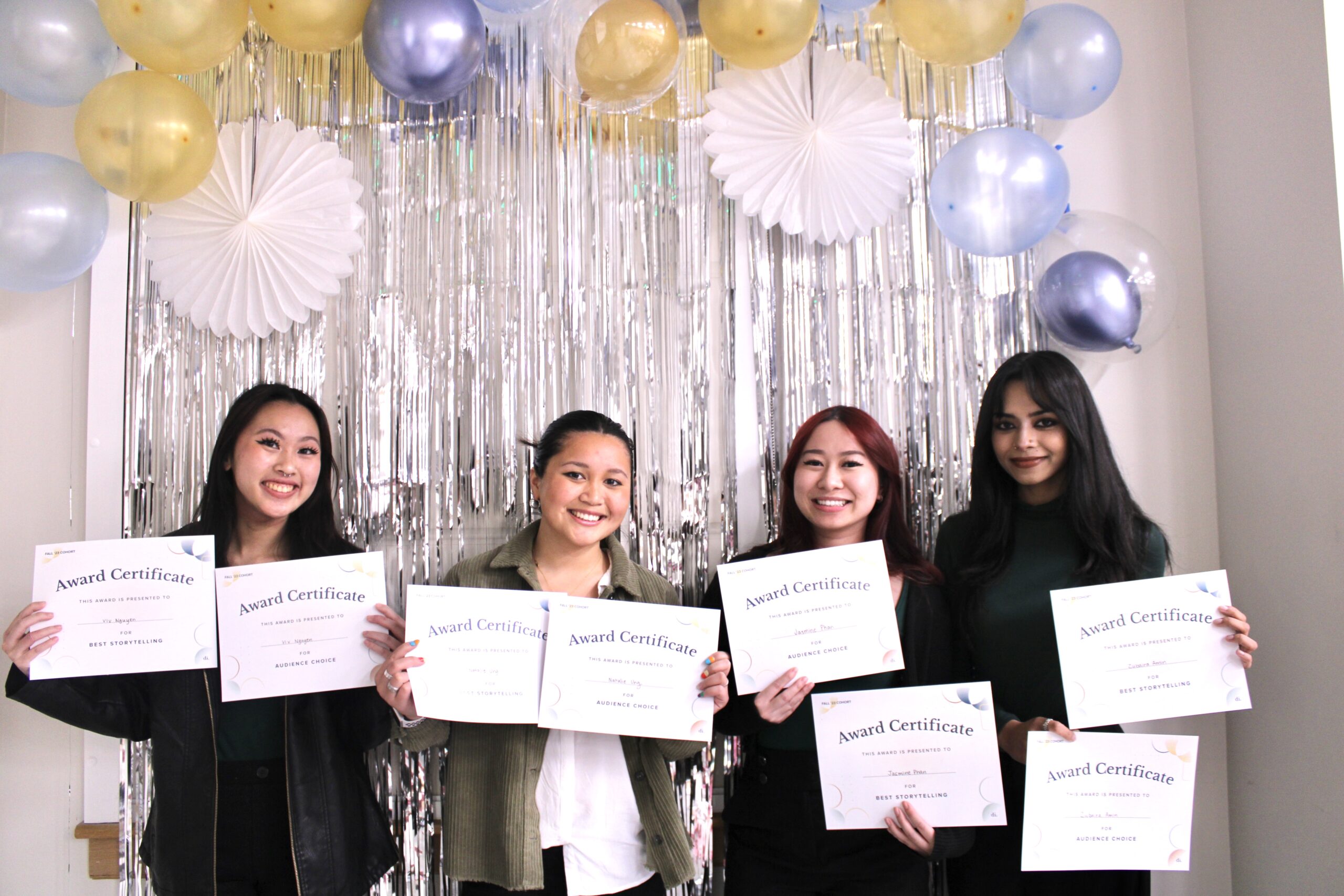
During presentation day, our team presented our 10 minute slide deck, complete with our entire design process and showcasing our final design prototype. We received valuable feedback from our industry panel judges on our overall UX as well as on details within our visual design. Following our feedback, we definitely would like to reassess some of our visual design elements such as type size and color. We would also love to conduct more usability testing on our final product. At the end of presentation day, our team was awarded Best Storytelling and Audience Choice!
| Our team on presentation day!
| Link to our interactive prototype: PagePals Prototype
